
As a future-oriented brand, the “Breuer+Nohr” training platform wanted to become visually younger, more versatile and more flexible. This is how we did it...
About Breuer+Nohr
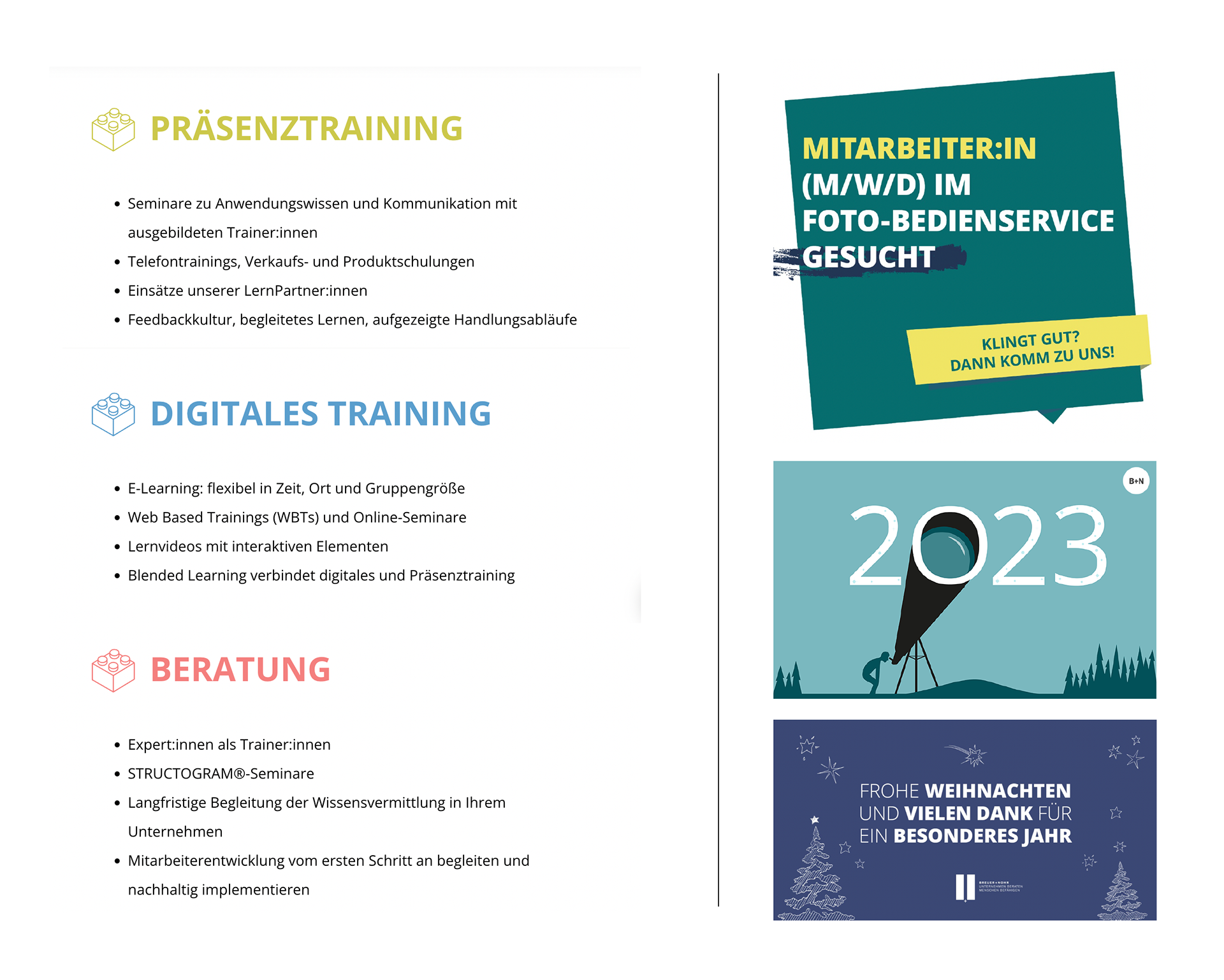
Breuer+Nohr supports well-known retail companies and service providers in employee development – with tailor-made face-to-face and digital training. And they give advise on the selection and introduction of learning opportunities in companies.
Christoph Breuer and Klaus Nohr started in 1993 with the idea of offering sales training from a new perspective. While the usual training offerings previously focused primarily on the products to be sold, the two agency founders wanted to focus on the needs of the learners in their approach, which determines the work of Breuer+Nohr til today.
A little later, the face-to-face training was supplemented by consulting. The agency has also been offering digital training formats for around 20 years – and so the team and its skills are constantly growing. Today, they offer an extensive portfolio of learning formats that can be combined as needed – whether face-to-face or digital.
Breuer+Nohr is made of 16 colleagues and not to be forgotten are approximately 80 learning partners, all committed to the Breuer+Nohr customer projects on site throughout Germany.
Analysation
The Corporate Design that is currently in use has developed steadily but minimally over the years and has been adapted to the needs of Breuer+Nohr's services and products.
It was time to find a good solution to make the platform younger, more digitally capable and, above all, more flexible for the various touchpoints and appearances of the brand identity to make it ready for the future.
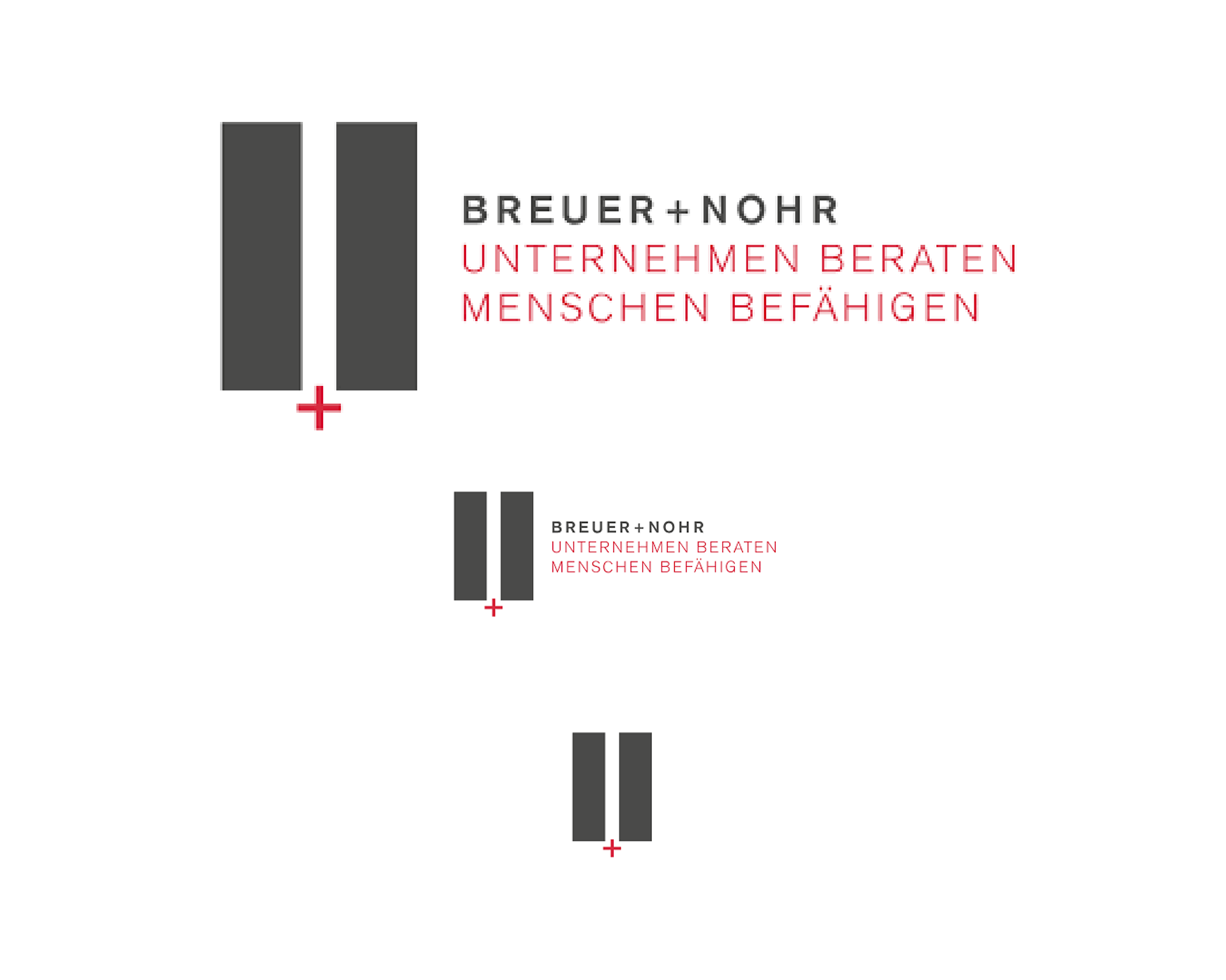
To do this, the previous components of the brand identity were analyzed and examined. One challenge was the logo, which could not be optimally used for smaller applications.
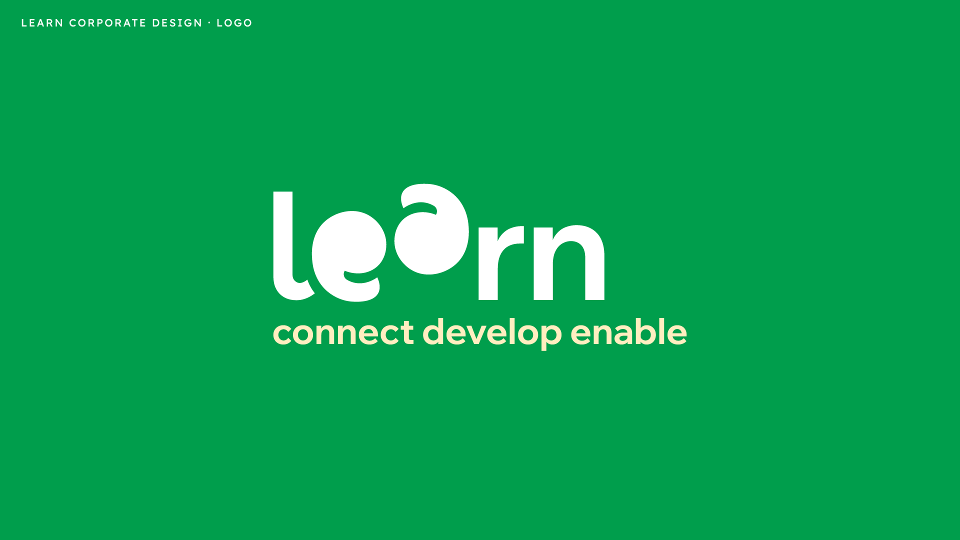
For Breuer+Nohr it was clear: a new name had to be found. After a few workshops on brand strategy, which had already taken place internally before the brand identity process, the name and the new values were determined:
Learn – connect, develop, enable.
Learn – connect, develop, enable.
Development
The goal was to develop a new brand evolving out of the current platform.
It should appear more positive, younger and offer a wide variety of design assets that would enable a greater scope for identity-preserving applications. Other successful training platforms such as Duolingo, Skillshare and Thinkific served as inspiring examples.
Final Identity
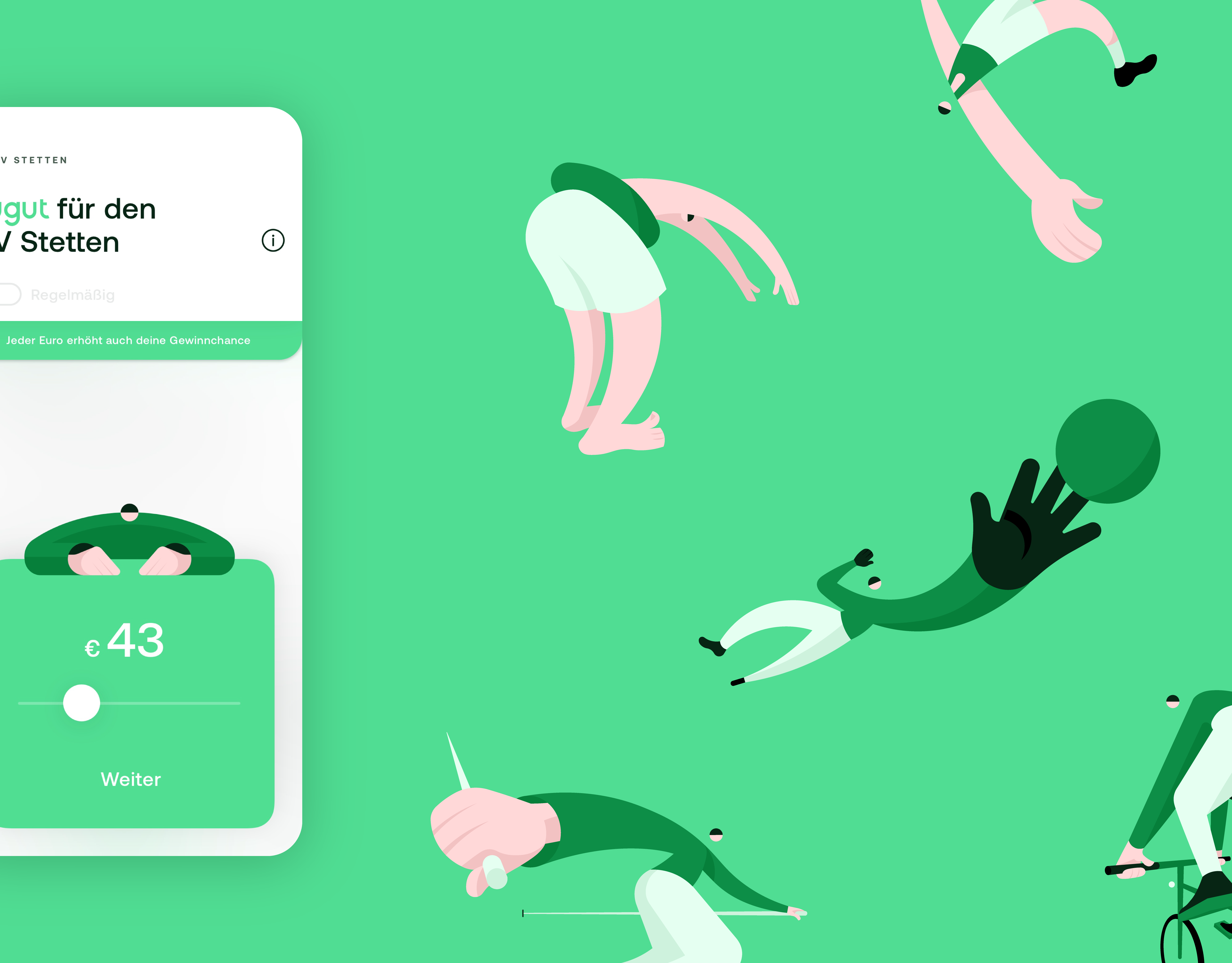
The new identity for “Learn” offers everything that is important for a successful future of the platform:
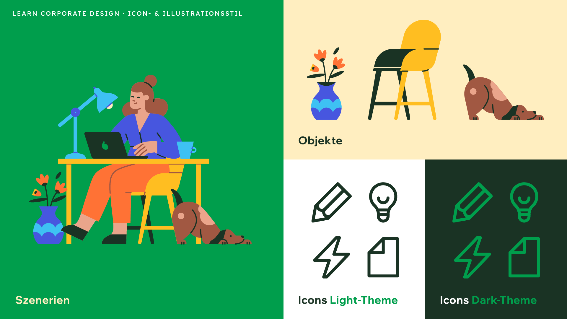
An optimistic green and vibrant colors for illustrations and detail pages.
A friendly and digitally-oriented new corporate typeface.
And a Supersign made of quotation marks that brings the exchange between the learners and teachers into focus, is more approachable and more human.
A friendly and digitally-oriented new corporate typeface.
And a Supersign made of quotation marks that brings the exchange between the learners and teachers into focus, is more approachable and more human.
From top to bottom:
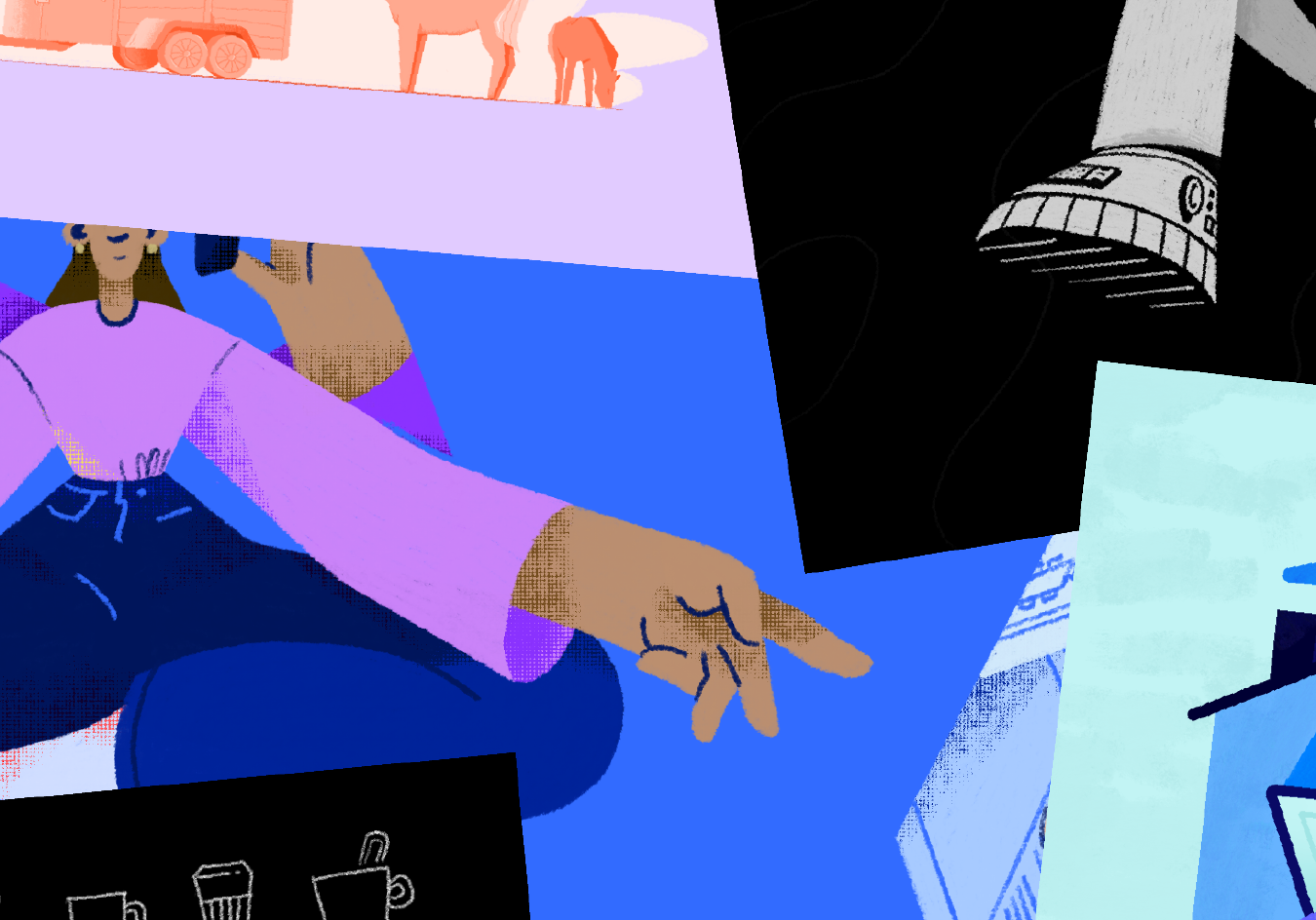
Supersign · Wallet System as Key Visual · Set of Illustrations (Open Source Library) · Social Media
Supersign · Wallet System as Key Visual · Set of Illustrations (Open Source Library) · Social Media