
— MY RESPONSIBILITIES
Brand Identity · Strategy · Design · UX/UI (Brand Portal)
Brand Identity · Strategy · Design · UX/UI (Brand Portal)
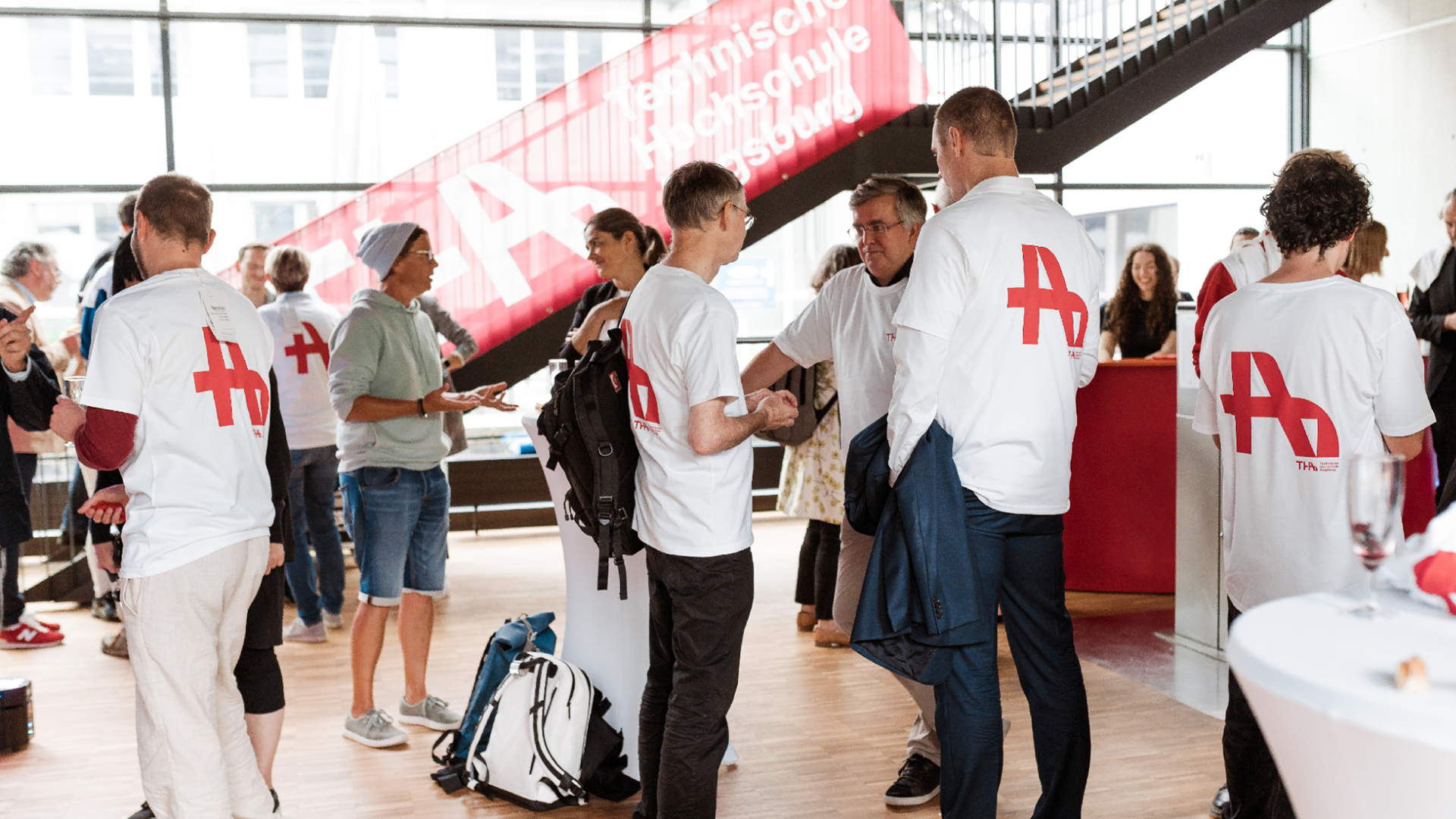
How to Rebrand a University
After an intensive and well-thought-out design process, we worked together to give Technical University of Applied Sciences Augsburg a new brand identity and strong value proposition that both future and current students can identify with.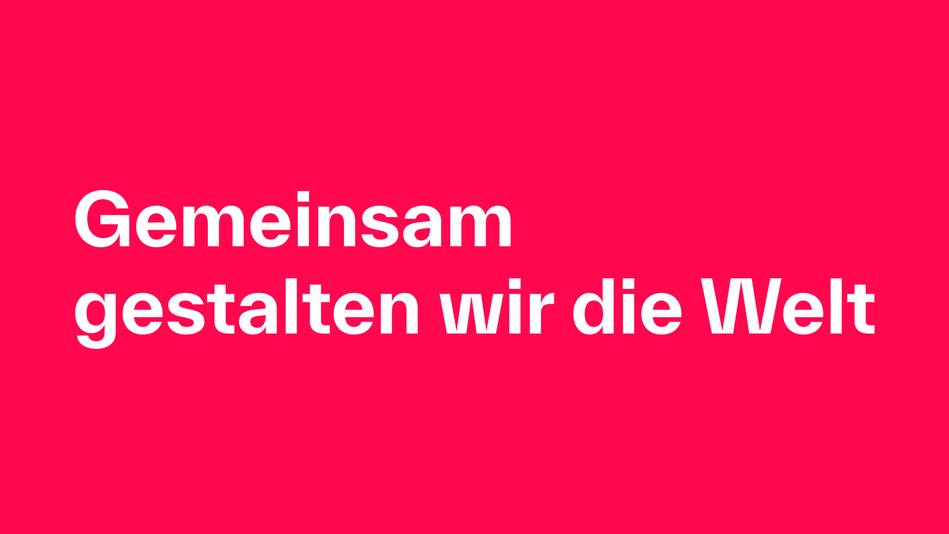
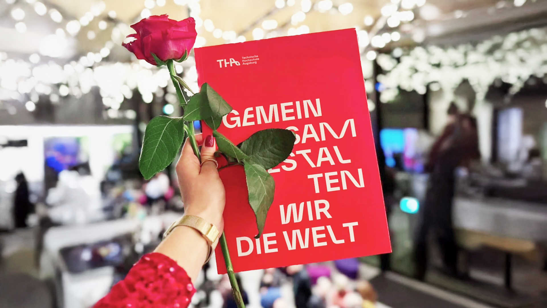
The new claim "Together we shape the world" unites and describes what constitutes the cooperation and interface between teachers, students and partners of the university.
Augsburg Technical University is a place where interdisciplinary work is combined with meaningful concepts in teaching and research. A place where people have a central role and where personal development is seen as its social mission.
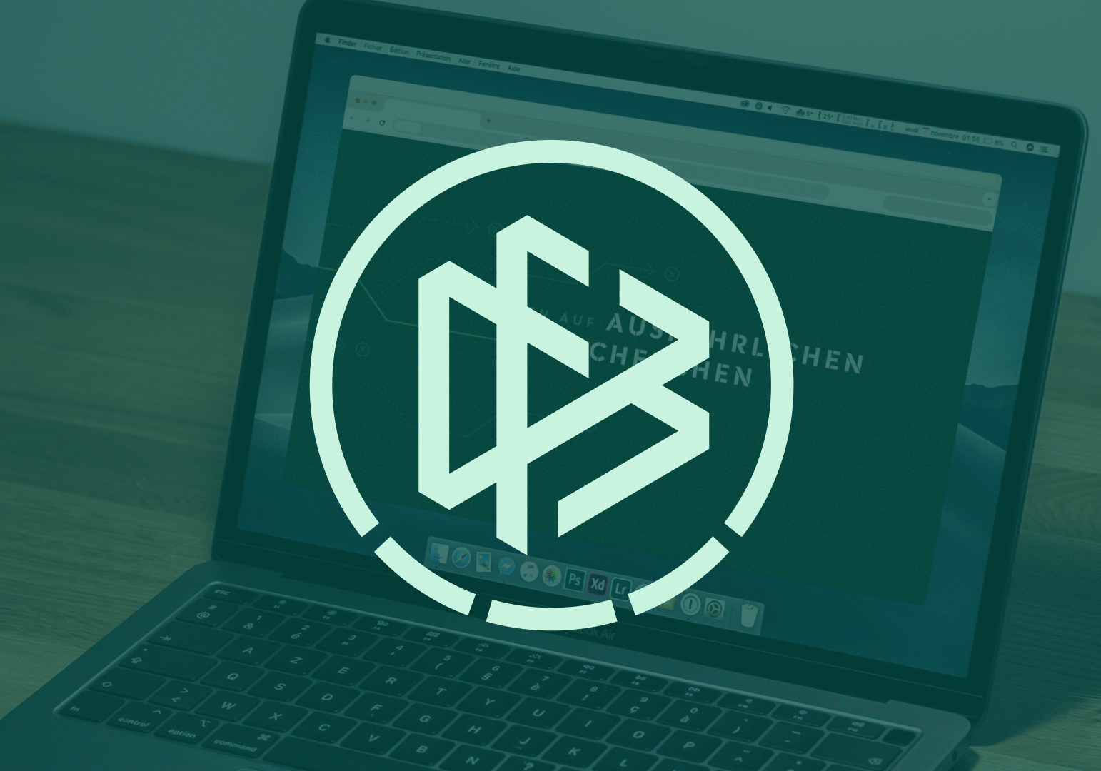
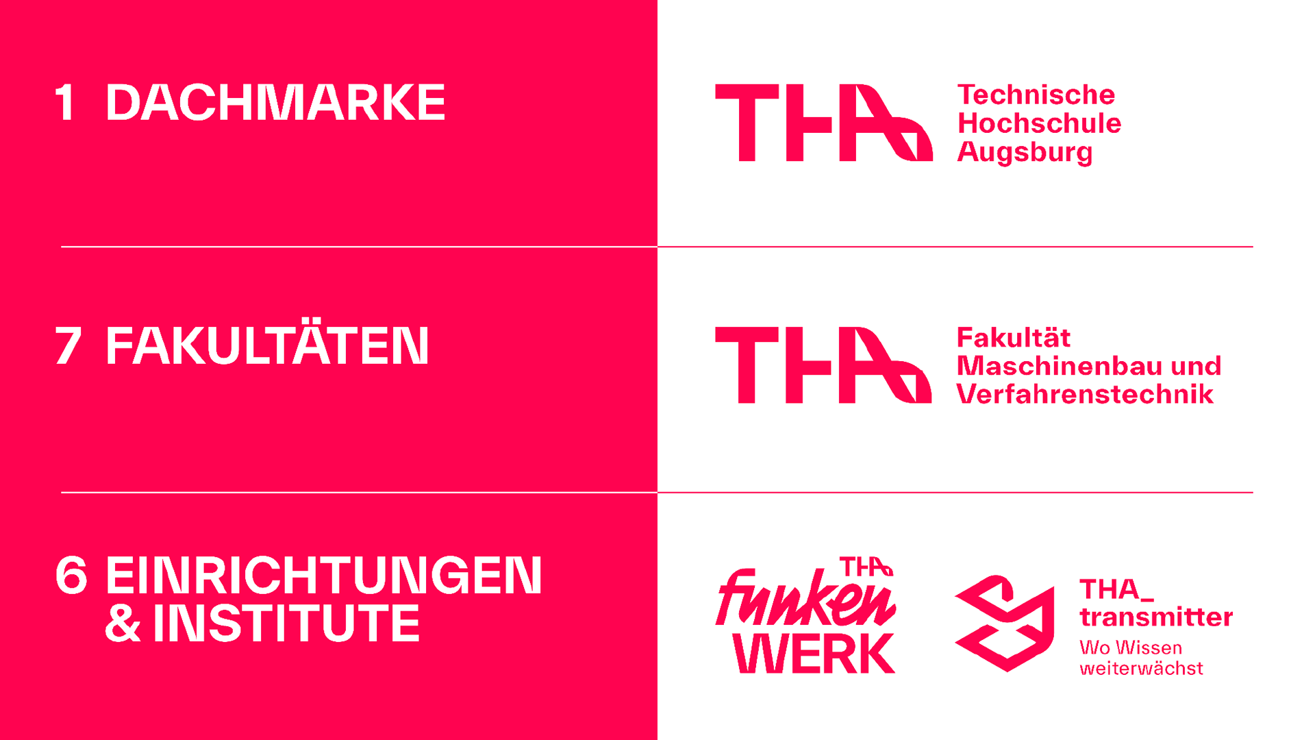
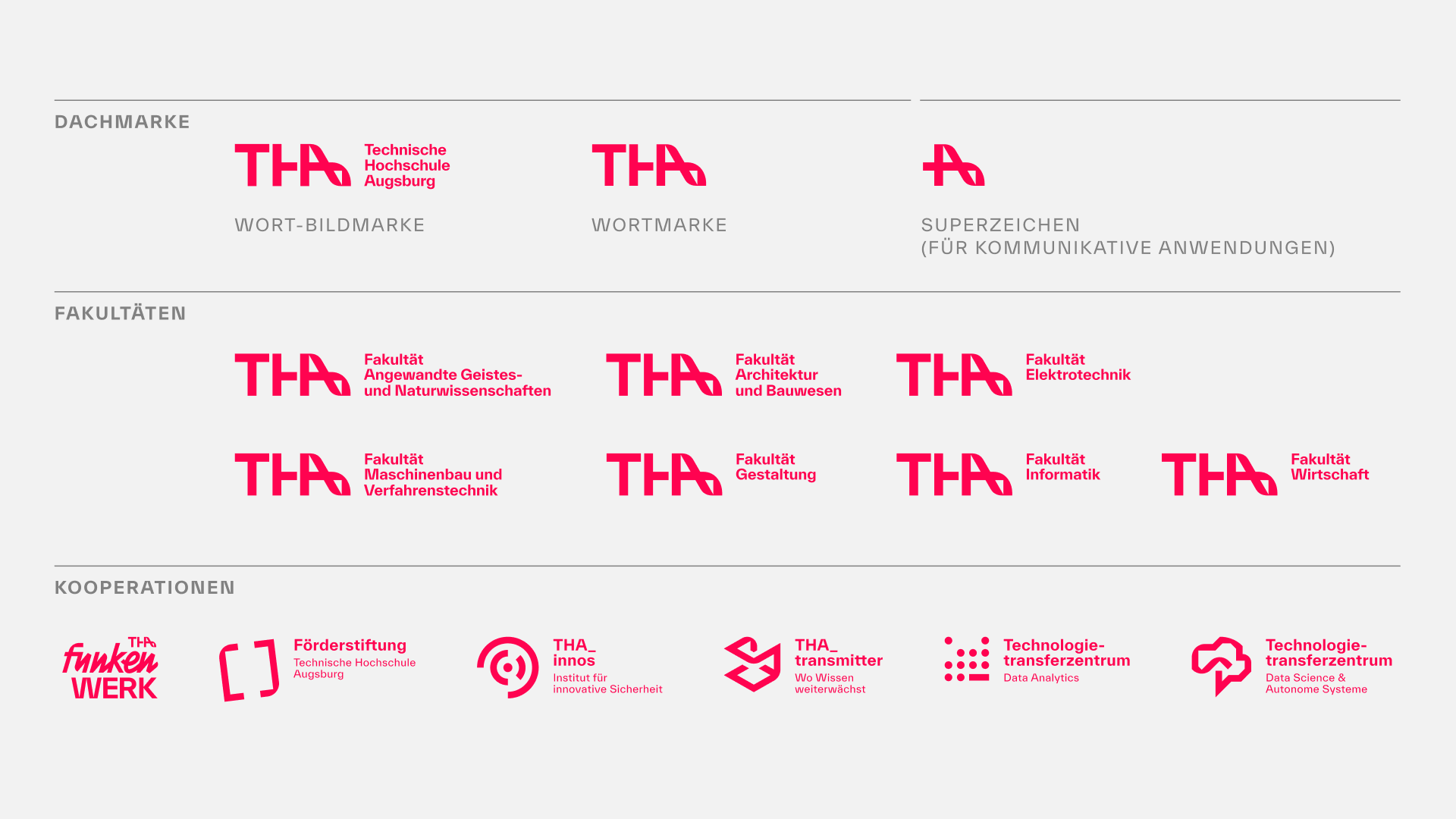
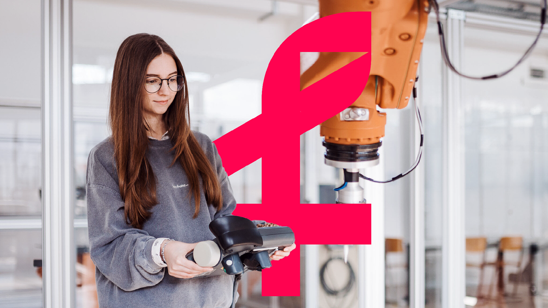
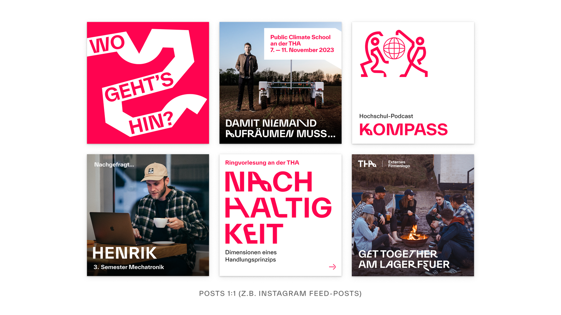
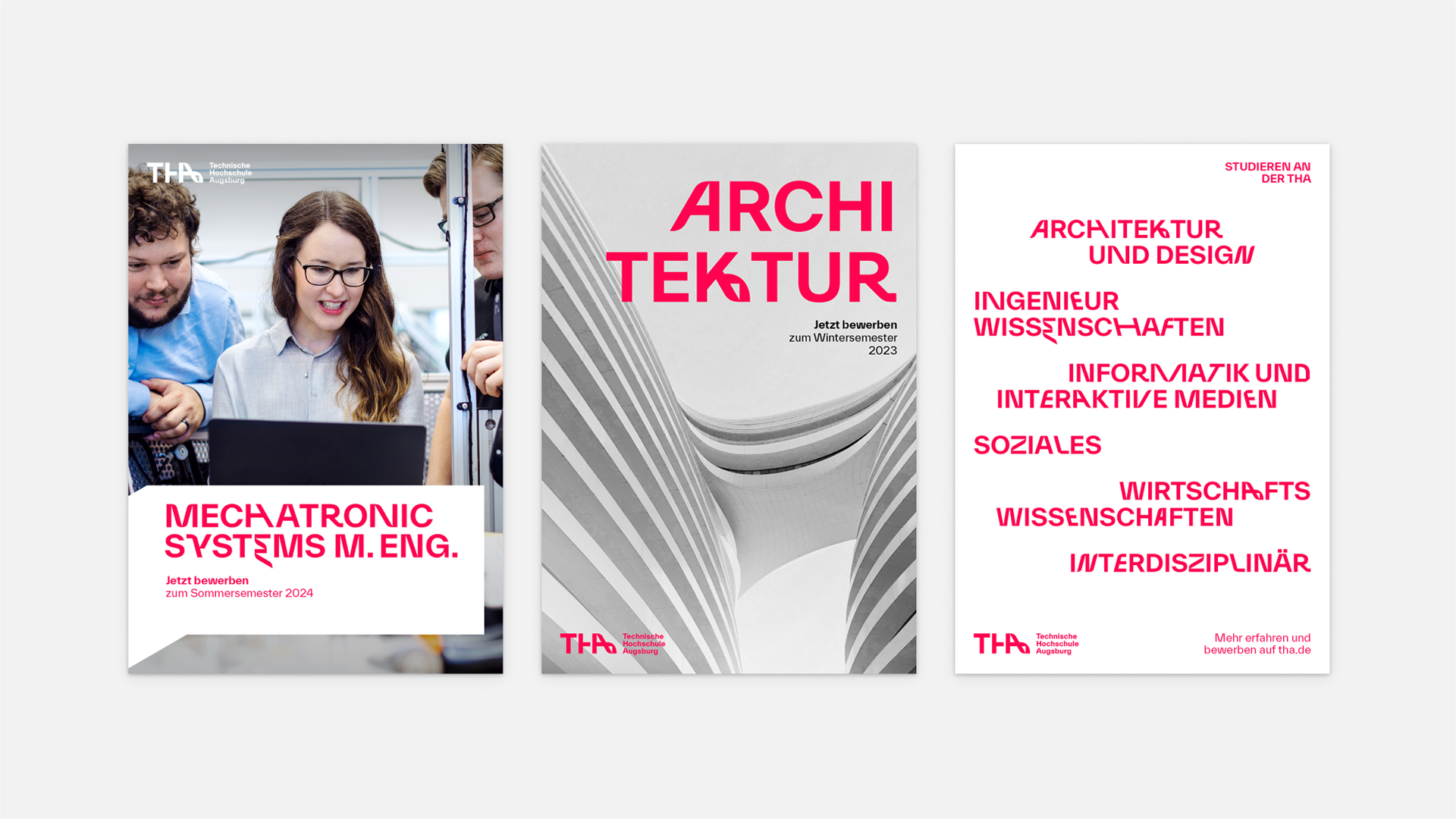
We symbolized this unique connection as a ribbon, that became the heart of the new visual identity. Derived from the logo, it runs through all design elements as a key visual and the central design language for all departments and faculties.

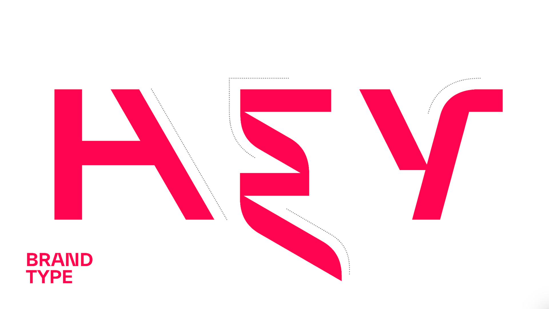
Together with type designer Nolan Paparelli, we have developed a unique typeface that expresses the principles and values of the university.
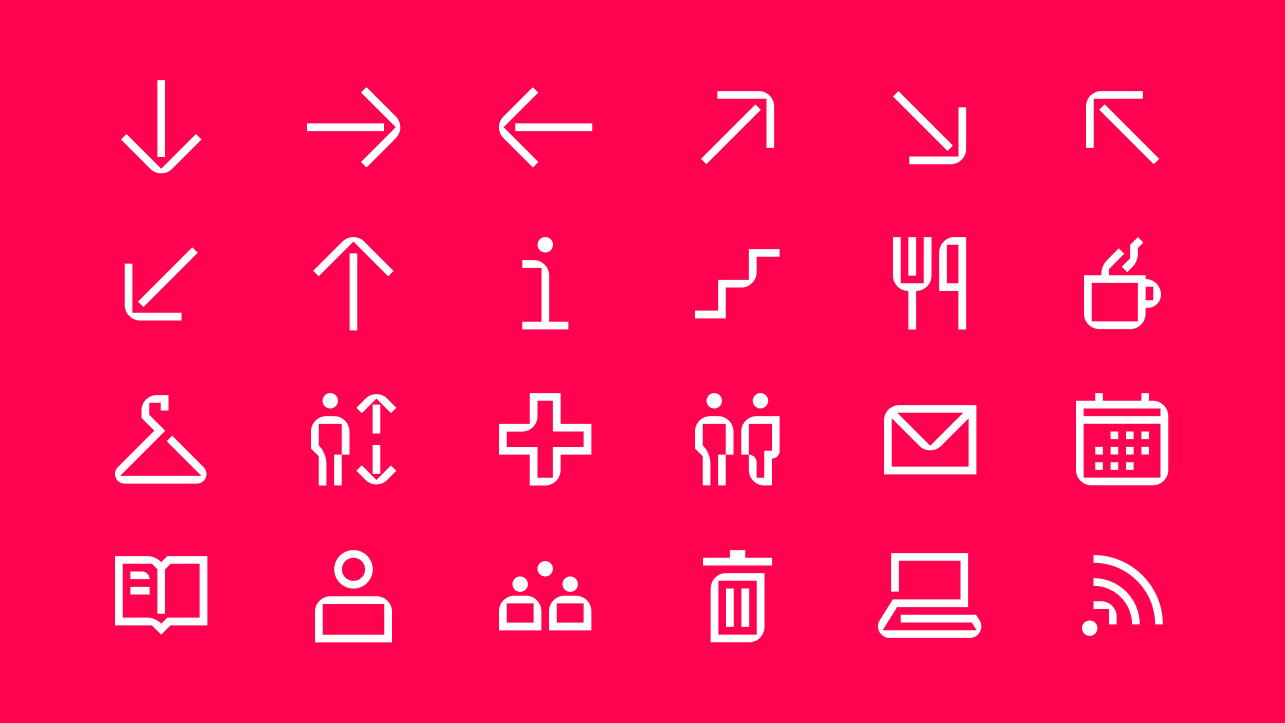
To ensure and support consistent adoption of the new brand identity, a brand portal was developed to provide clear, concise, and comprehensive guidance for all stakeholders.


This project was created as part of an employment at Strichpunkt Design.
Font Design THA Everett in collaboration with Nolan Paparelli.
Font Design THA Everett in collaboration with Nolan Paparelli.